top of page

It features a more minimalistic approach in order to use the essential elements and still illustrate the same symbols like the previous logo option: water and gas phases in the sewer system.

A monogram type logo with hidden double arrows illustrating airflow and process.
The clean, straight lines express a professional feel, and highlight the technical rigorosity the company is famous for.
SPN9
Brochures, layout, graphic design
The Civil Engineering Department at Aalborg University organised a conference with guest from all over Europe.
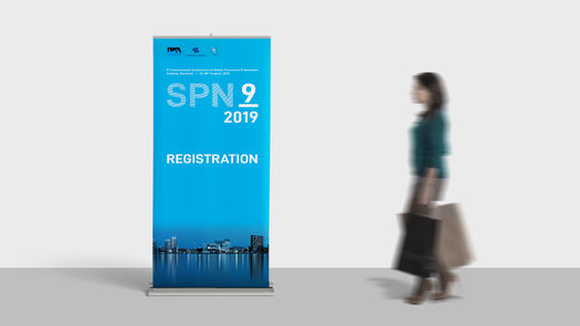
I was in charge for all graphic design related tasks for the event, e.g. announcement flyers, posters, rollups, T-shirts for the organisers and brochures.
It was an exciting project with lot to do, mostly for print.

bottom of page


